Difference between revisions of "DCD Blogs/7 Things I Learned from Leading a Design Project"
Ashley.evans (talk | contribs) (Created page with "FR:DCN_Blogues/L'essai de l’icône <!--The following line of code hides the page title--> {{DISPLAYTITLE:<span style="position: absolute; clip: rect(1px 1px 1px 1px); c...") |
|||
| (8 intermediate revisions by 2 users not shown) | |||
| Line 1: | Line 1: | ||
| − | [[FR:DCN_Blogues/ | + | [[FR:DCN_Blogues/Les sept leçons que j’ai tirées en dirigeant un projet de conception]] |
<!--The following line of code hides the page title--> | <!--The following line of code hides the page title--> | ||
| Line 5: | Line 5: | ||
<br> | <br> | ||
| − | <div align="center">[[File: | + | <div align="center">[[File:DCD Wiki Banner.png|center]]</div> |
<br> | <br> | ||
| Line 15: | Line 15: | ||
<br> | <br> | ||
<div style="border:1px solid #white; {{Round corners}}; text-indent: 8%; margin: 20px; margin: 0 auto; width: 700px; line-height: 2em; font-size:125%"> | <div style="border:1px solid #white; {{Round corners}}; text-indent: 8%; margin: 20px; margin: 0 auto; width: 700px; line-height: 2em; font-size:125%"> | ||
| − | '''<span style='color:#545454; font-size:125%'> | + | '''<span style='color:#545454; font-size:125%'>In November, two developers and I started working on a design system</span>''', for Government of Canada digital collaboration applications to guide the design of the next iteration of the [[ About_the_GCTools | GCTools]]. Over many days of planning and late afternoon epiphanies, we came up with a solid strategy and work plan to build something awesome. |
<br> | <br> | ||
<br> | <br> | ||
| − | + | Fast forward to today and we have four developers, three writers, three user experience researchers as well as design expertise across the whole project team. We’ve collaborated with six partners across four different organizations. Most importantly, over the past months, we’ve built and compiled a [https://gctools-outilsgc.gitbook.io/-gcdigital-design-system/ large repository of content] that matches the caliber of private tech companies, and connects the Government of Canada’s various digital resources, policies and learning material. | |
| + | </div> | ||
| + | <br> | ||
| + | <br> | ||
| + | [[File:7 Things I Learned Blog.jpg|906x608px|center]] | ||
| + | <div style="border:1px solid #white; {{Round corners}}; margin: 0 auto; line-height: 2em; width: 700px; font-size:125%"> | ||
| + | <br> | ||
| + | <br> | ||
| + | After six months of managing a project, I’ve definitely learned many things about myself, my teammates and the challenges surrounding every innovative or unconventional government project. Here are some of our key lessons learned: | ||
| + | </div> | ||
| + | <br> | ||
| + | <br> | ||
| + | <div style="border:1px solid #white; {{Round corners}}; margin: 0 auto; line-height: 2em; width: 700px; font-size:125%"> | ||
| + | '''<span style='color:#545454; font-size:125%'>1. Get to know people on your team.</span>''' They are everything to the success and enjoyment of your project. Knowing the strengths and weaknesses of the people on your team makes delegating tasks so much easier, and everyone should get a say and get a chance to work on something they’re interested in. And having a group of people that works well together makes everything smoother and more fun! | ||
<br> | <br> | ||
<br> | <br> | ||
| − | + | '''<span style='color:#545454; font-size:125%'>2. Building anything new is a messy process.</span>''' Try to organize the chaos best you can, but accept that the amount of uncertainty and tough questions will feel overwhelming at times. | |
</div> | </div> | ||
<br> | <br> | ||
| − | |||
<br> | <br> | ||
| + | [[File:7 Things I Learned Blog Stock.jpg|789x530px|center]] | ||
<div style="border:1px solid #white; {{Round corners}}; margin: 0 auto; line-height: 2em; width: 700px; font-size:125%"> | <div style="border:1px solid #white; {{Round corners}}; margin: 0 auto; line-height: 2em; width: 700px; font-size:125%"> | ||
| − | |||
<br> | <br> | ||
<br> | <br> | ||
| − | + | '''<span style='color:#545454; font-size:125%'>3. Be strategic about working with others.</span>''' Partners and collaborators are valuable, but can also broaden the project far beyond its original scope. Stick to your original goals and have a clear plan from the start on who to engage with, and when to engage them. | |
| + | <br> | ||
| + | <br> | ||
| + | '''<span style='color:#545454; font-size:125%'> 4. Planning is good; building is better.</span>''' Since this project started in parallel with the rebuild of our applications, there were a lot of questions that were still unanswered. At some point we had to just get started and see what kind of process evolved. We had to adapt our original process as we went, but no amount of planning would have avoided that. | ||
| + | <br> | ||
| + | <br> | ||
| + | '''<span style='color:#545454; font-size:125%'>5. Democracy is good, but eventually someone has to make a decision.</span>''' Critique and feedback is necessary, but not every decision will be a full consensus. That’s okay. Have faith in your judgment, and change things later as you gain new information. | ||
| + | <br> | ||
| + | <br> | ||
| + | '''<span style='color:#545454; font-size:125%'>6. Content is always king.</span>''' Your work should speak for itself. Be proud of it, pour all your expertise into it, and take ownership of your work! (Even if we’re so often afraid in government to do that). | ||
| + | <br> | ||
| + | <br> | ||
| + | '''<span style='color:#545454; font-size:125%'>Bonus:</span>''' Food is always the best way to get to know people, to apologize, or to celebrate. Start your meetings off right with Timbits! | ||
| + | <br> | ||
| + | <br> | ||
| + | '''<span style='color:#545454; font-size:125%'>Curious to know where we’re at with the Design system?</span>''' | ||
<br> | <br> | ||
<br> | <br> | ||
| − | + | Now in phase II, our design system currently contains enough content to start building application wireframes, learn more about design, and apply common styles to all our digital products. Completely open, the design system is available via our [https://github.com/gctools-outilsgc/design-system Github repository] and our [https://gctools-outilsgc.gitbook.io/-gcdigital-design-system Gitbook documentation]. | |
<br> | <br> | ||
<br> | <br> | ||
| − | + | As the GCTools and other digital applications evolve, our design system will undertake constant modifications and additions. Do you have suggestions or comments about our content? Want to make use of our system? [https://github.com/gctools-outilsgc/design-system/issues Submit an issue] through Github or [mailto:sierra.duffey@tbs-sct.gc.ca?subject=GCdigital%20Design%20System contact me directly]! | |
</div> | </div> | ||
<br> | <br> | ||
<br> | <br> | ||
Latest revision as of 11:19, 26 June 2018
In November, two developers and I started working on a design system, for Government of Canada digital collaboration applications to guide the design of the next iteration of the GCTools. Over many days of planning and late afternoon epiphanies, we came up with a solid strategy and work plan to build something awesome.
Fast forward to today and we have four developers, three writers, three user experience researchers as well as design expertise across the whole project team. We’ve collaborated with six partners across four different organizations. Most importantly, over the past months, we’ve built and compiled a large repository of content that matches the caliber of private tech companies, and connects the Government of Canada’s various digital resources, policies and learning material.
After six months of managing a project, I’ve definitely learned many things about myself, my teammates and the challenges surrounding every innovative or unconventional government project. Here are some of our key lessons learned:
1. Get to know people on your team. They are everything to the success and enjoyment of your project. Knowing the strengths and weaknesses of the people on your team makes delegating tasks so much easier, and everyone should get a say and get a chance to work on something they’re interested in. And having a group of people that works well together makes everything smoother and more fun!
2. Building anything new is a messy process. Try to organize the chaos best you can, but accept that the amount of uncertainty and tough questions will feel overwhelming at times.
3. Be strategic about working with others. Partners and collaborators are valuable, but can also broaden the project far beyond its original scope. Stick to your original goals and have a clear plan from the start on who to engage with, and when to engage them.
4. Planning is good; building is better. Since this project started in parallel with the rebuild of our applications, there were a lot of questions that were still unanswered. At some point we had to just get started and see what kind of process evolved. We had to adapt our original process as we went, but no amount of planning would have avoided that.
5. Democracy is good, but eventually someone has to make a decision. Critique and feedback is necessary, but not every decision will be a full consensus. That’s okay. Have faith in your judgment, and change things later as you gain new information.
6. Content is always king. Your work should speak for itself. Be proud of it, pour all your expertise into it, and take ownership of your work! (Even if we’re so often afraid in government to do that).
Bonus: Food is always the best way to get to know people, to apologize, or to celebrate. Start your meetings off right with Timbits!
Curious to know where we’re at with the Design system?
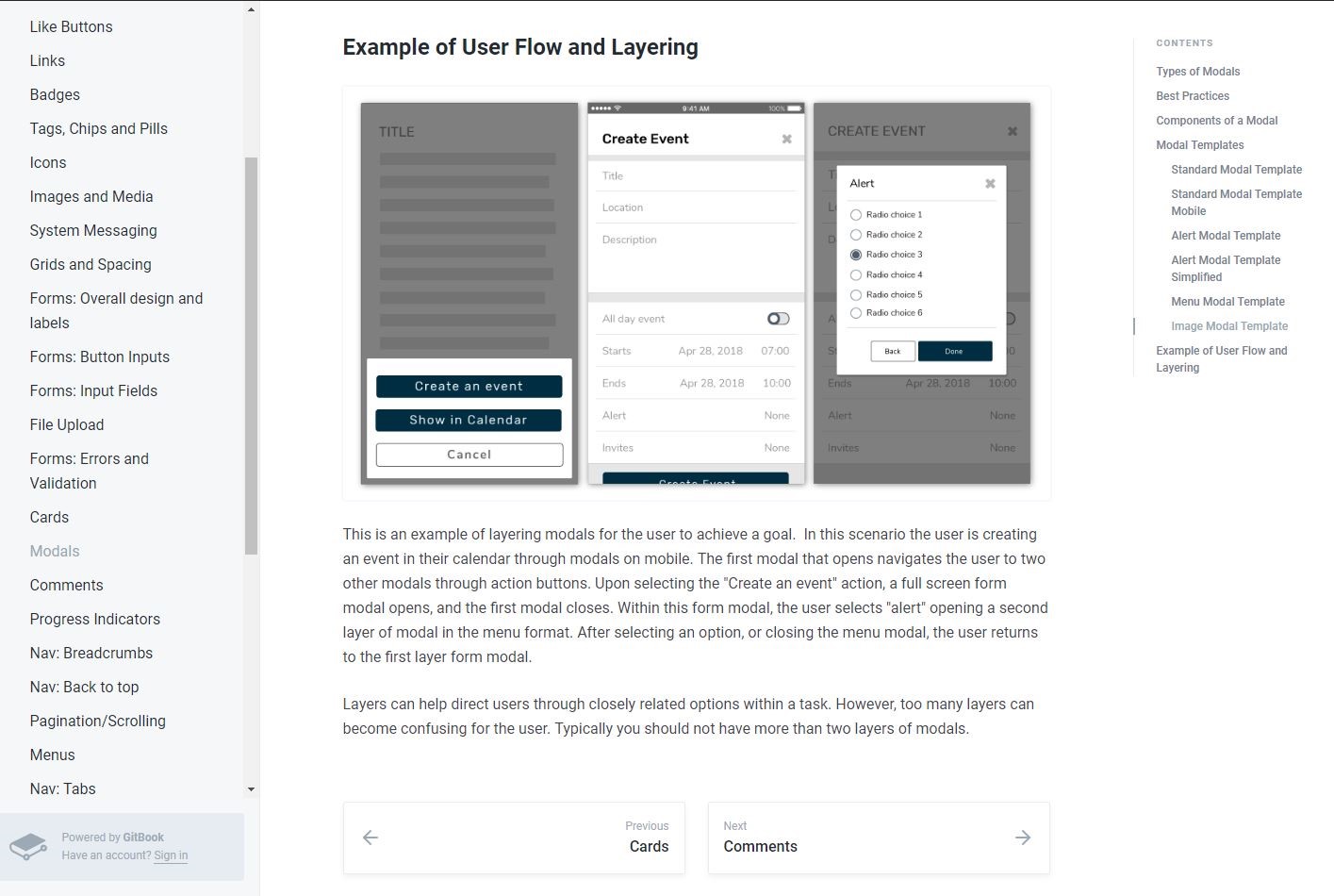
Now in phase II, our design system currently contains enough content to start building application wireframes, learn more about design, and apply common styles to all our digital products. Completely open, the design system is available via our Github repository and our Gitbook documentation.
As the GCTools and other digital applications evolve, our design system will undertake constant modifications and additions. Do you have suggestions or comments about our content? Want to make use of our system? Submit an issue through Github or contact me directly!


