CSPS Tech Lab/vExpo/Content & Design Guidelines
 |
À l’heure actuelle, cette page est en cours de développement initial. Son contenu devrait être considérablement modifié d’ici peu de temps. This page is currently under its initial development. Its contents should change significantly over a short period of time. |
| About vExpo | Content & Design Guidelines | The Team Behind vExpo... |
Content and Design Guidelines
The guidelines below provide information on the content and design requirements for the development of a virtual lobby and kiosk. If you have requested a lobby or kiosk, please pay close attention to the sections entitled "What we need from you", as this outlines the content and material you will need to provide prior to the agreed-upon deadline.
What product guidelines are you looking for?
Virtual lobby  |
Virtual kiosk  |
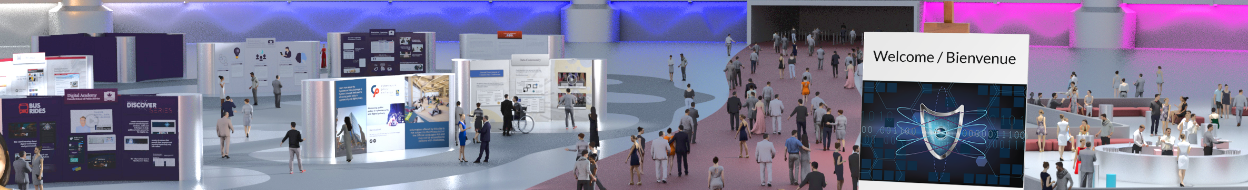
vExpo Lobby
The vExpo lobby is designed to provide participants with easy access to the event’s content and activities, such as links to:
- Event Agenda
- Speaker(s) biographies
- Main presentation (e.g. webcast)
- Breakout sessions
- Kiosks
All content accessible through the lobby must comply with the requirements outlined below.
Content requirements
All content to be included in a vExpo lobby must:
- Be available on the web (e.g. department site, GCwiki, GCpedia, Youtube, etc.) so that we can link to it directly.
- Note: the Digital Academy will not host any content for the lobby. However, the team can provide support to help you find the best options to make your content available on the Web.
- Be available in both official languages
- Be accessible (i.e readable using assistive technology, alt text, transcripts, closed captions, etc.)
- Note: The CSPS Digital Academy is committed to offer content and products that are fully accessible and inclusive. Content that does not meet accessible requirements will not be included in the lobby (e.g. no PDFs will be accepted).
Public Access
The vExpo is available publicly on the Web for anyone to see and access. By default, all content available from the lobby and kiosks should:
- have open access to be viewed publicly, without login or restricted permissions.
- have the appropriate copy rights to be shared publicly.
- Note: Although we do not recommend it, it is possible to restrict access to GC employees by hosting your content on a GCpedia page, which can only be accessed when on the GC network.
|
What we need from you To help us develop the virtual lobby within the required timeframe, we will need you to provide the following items:
|
Hotspots
All the vExpo lobby elements mentioned above will be converted into a hotspot (or link). The hotspots allow the participants to navigate to the target destination where they can view the content (web page, youtube, presentation, etc.). Each hotspot has a descriptive text and icon that are displayed in a card that appears when the user moves their mouse over it. This same card is also re-used in the mobile and accessible version of the lobby.

Virtual Kiosks
The virtual kiosks are designed to provide participants with easy access information about partners and their initiatives. Kiosks usually include:
- Kiosks name
- Contact information
- Links to websites, videos and podcasts, etc.
All content accessible through the kiosks must comply with the requirements outlined below.<>
Content requirements
All content to be included in a kiosk must:
- Be available on the web (e.g. department site, GCwiki, GCpedia, Youtube, etc.) so that we can link to it directly.
- Note: the Digital Academy will not host any content for the kiosk. However, the team can provide guidance to help you find the best options to make your content available on the Web.
- Be available in both official languages.
- Be accessible (i.e readable using assistive technology, alt text, transcripts, closed captions, etc.)
- Note: The CSPS Digital Academy is committed to offer content and products that are fully accessible and inclusive. Content that does not meet accessible requirements will not be included in the kiosk (e.g. no PDFs will be accepted).
Public Access
The vExpo is available publicly on the Web for anyone to see and access. By default, all content available from the lobby and in the kiosk should:
- have open access to be viewed publicly, without login or restricted permissions.
- have the appropriate copy rights to be shared publicly.
- Note: Although we do not recommend it, it is possible to restrict access to GC employees by hosting your content on a GCpedia page, which can only be accessed when on the GC network.
|
What we need from you
For each individual piece of content becoming a hotspot:
|
Design and Visual Guidelines
The virtual kiosks are used to provide users with an overview of a department’s or group’s mandate, projects and/or initiatives. To have a successful product, here are some key considerations when gathering and submitting content to be included in your kiosk.
General layout
A balanced composition normally is achieved by using 3 panels to showcase your content, accompanied with a separator panel that usually displays a title.

- Note: It can sometimes be tempting to want to add as much information as possible on the kiosk and use as much real-estate as possible. However, this is not recommended as it can become overwhelming for the viewers and fail to achieve the main objective - to encourage viewers to click on the kiosk links and learn more about what you have to offer.
Kiosks often include 4 key elements:
Kiosk identity: Positioned at the top of the middle panel, this area includes the name of the kiosk (e.g. organization name) and, if available, any image or official logo associated with it.

Content elements: This includes the different pieces of content that are displayed on the kiosk. They are the key elements that attracts the viewers’ attention, on which they can click to navigate to more detailed information (i.e. Website, video, etc.). This usually includes a combination of icons or images (ex: screens-shots of a web page or video, stock images, etc) with some short decorative text that helps to give some quick and short context to what the idea or project is about.

Contact information: This will be the points of contact that can be used by viewers to reach out to you, follow you on social media, etc., usually making use of social media icons.
Hotspots: Any of these elements mentioned above will be converted into a hotspot ( link) that viewers can click on to navigate to the target destination (i.e. Website), which is the actual content we want people to see. Each hotspot is accompanied by an information card that appears at the bottom of the screen on mouse-over (when the viewer’s cursor hovers over the hotspot). This information card includes a descriptive text and icon, and is used as a call to action, explaining why they should click on the link (e.g. Learn about the Discover Series. Visit the Website,). The text and icon used within the information card is also re-used for the mobile and accessible version of kiosk.

Visual content guidelines
Display the optimal amount of content. To ensure a good and effective design, we recommend having 1 to 5 hotspot in each panel of your kiosk. Plan and choose the key projects or initiatives you want to showcase, to effectively guide viewers to click on each hotspot. If one panel has no hotspot, it’s a missed opportunity. On the other hand, having too many hotspots (more than 5) will overload the viewers and their attention will be split in too many directions, making it less effective.

Keep decorative text short and simple. The text used directly in the kiosk background acts as a decorative visual element and should only be used to provide additional context to the hotspot (often represented by an image or icon). As a result, the decorative text needs to be very short and simple, creating curiosity. This text is only decorative, and does not appear on the mobile and accessible version of the kiosk. As a result, do not include any important information in the decorative text that is not available elsewhere. Keep it short and sweet… using a long paragraph tends to discourage users and will lose their attention.

Consider the overall look when selecting images. The proper selection of images is key. Each image must be coherent with the context in which they are used while also considering the overall design composition of the kiosk. The images should share the same style and tone to ensure a professional look. Combining images with different styles and colors schemes could lead to the impression of disorganization and lack of structure, affecting the effectiveness of the kiosk.
- Note: If you are uncertain about what images to include, you can suggest images and icons, which we will use as guides to create the final designs, ensuring a coherent look and feel.
Share your departmental branding books, guidelines, etc. Let us know if your kiosk should follow a specific departmental branding or look and feel. In order to insure that the final design respects the visual identity of the organization, make sure to share the branding book, or material. You are responsible to work with, and confirm with your communications team if and how the departmental branding should be used on the kiosk.
Provide the right asset format and quality. To ensure high quality visuals, please send all assets in vector format (.ai, .eps, .svg, etc.). If not possible, send only high resolution images.
- Note: Each panel in the kiosk is 2000x3000px. In this context, high resolution will have to be enough size to have a good representation of the given asset in that canvas size.