Important: The GCConnex decommission will not affect GCCollab or GCWiki. Thank you and happy collaborating!
DCD Blogs/Icon Testing
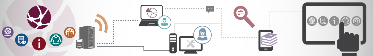
Last week at the Innovation Fair, the Digital Collaboration Division team invited guests to take part in an icon testing experiment. The Digital Collaboration Division (GCTools team) is working on a redesign to make the different tasks (i.e. blogs, the Wire, GCcollab, the Wiki, profile) into one centralized application suite, and we want to make sure we get it right! To create the best tools possible for users across government, private industry, and academia, we will be conducting usability tests regularly. This was the first step!
Redesigning a website is hard, and requires incredible attention to detail, which is why we need to test everything — even something as small as icons used on the site. Icon testing is done to make sure that when various icons are used on our webpages, users will understand what they mean, and what functions they might find if they click on the icon. This is important because users with different cultural and technological experiences may ascribe different meanings to different icons. This can cause trouble when attempting to convey a singular meaning through a simple image.
Alongside the development team, we decided to look at three categories of icons, and chose six icons for people to choose from: a gear, a wrench, a hamburger menu, a waffle menu, a bell, and a flag. We displayed icons commonly used to represent settings, application selection and notifications — three important functions in any app suite