Important: The GCConnex decommission will not affect GCCollab or GCWiki. Thank you and happy collaborating!
Difference between revisions of "GCDigital design system"
m |
m |
||
| Line 1: | Line 1: | ||
| − | + | [[File:Design_system.png|345x345px]] | |
* [https://github.com/gctools-outilsgc/design-system Github Repository] | * [https://github.com/gctools-outilsgc/design-system Github Repository] | ||
| Line 210: | Line 210: | ||
* '''Open:''' the design system will be open and accessible to anyone who wishes to use it. All code is open source, and other guidelines and elements are free to copy. | * '''Open:''' the design system will be open and accessible to anyone who wishes to use it. All code is open source, and other guidelines and elements are free to copy. | ||
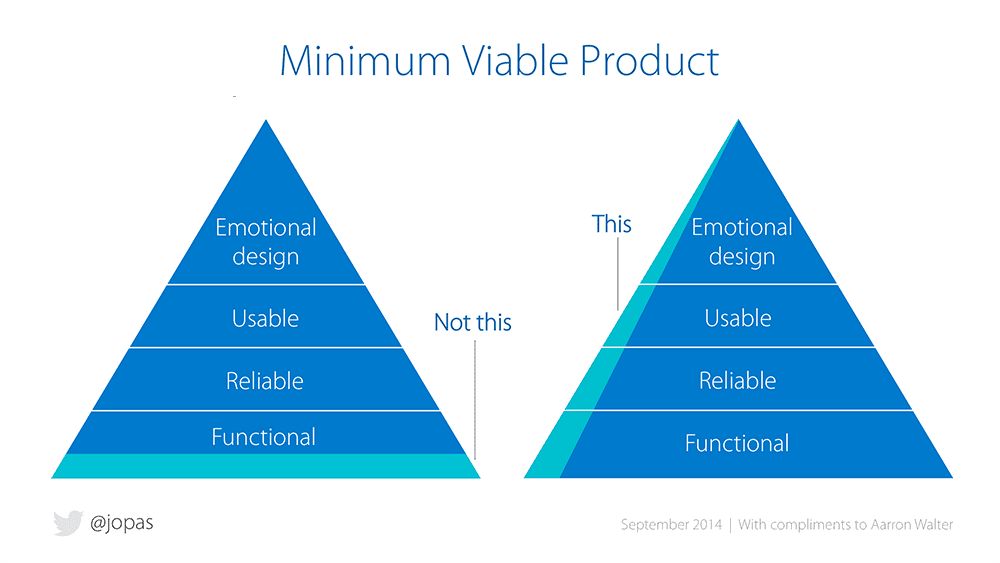
| − | + | [[File:MVP_triangle.png|1000x1000px]] | |
==== Project Phases ==== | ==== Project Phases ==== | ||
* '''Phase I:''' first prototype, design-focused elements and basic UI components. Includes elements that will be useful to all partners | * '''Phase I:''' first prototype, design-focused elements and basic UI components. Includes elements that will be useful to all partners | ||
| Line 255: | Line 255: | ||
* Downloads/Resources (Illustrator, Photoshop or Sketch files available for download) | * Downloads/Resources (Illustrator, Photoshop or Sketch files available for download) | ||
==== Project Timeline ==== | ==== Project Timeline ==== | ||
| − | + | [[File:DS Project Timeline.JPG|1152x1152px]] | |
==== Design Sprints ==== | ==== Design Sprints ==== | ||
Revision as of 11:06, 18 April 2018
Information about the design system project started by the Digital Collaboration Division (GCTools) in collaboration with the Canadian Digital Service, Immigration, Refugees and Citizenship Canada, Talent Cloud, and TBS Interoperability.
What is a design system?
A catalogue of everything that makes up your digital product, including UI elements, writing style, guiding principles, coding standards, visual design, etc. The system provides information about your product or set of products, and provides reusable components for easy development.
Building a design system is a collaborative effort and requires expertise across all fields in web/application design. A design system takes into account all aspects of the product and encompasses all levels of the user and the creator’s experience.
Why do we want to build one?
- Consistency across applications and platforms, particularly taking into consideration the rebuild of the GCTools or other digital collaboration services.
- Partnership opportunities with interested communities, including the Canadian Digital Service, Talent Cloud, other teams in CIOB, and the design team at IRCC.
- Saves development and design time since components are reusable and effectively organized. Would complement the agile development process by removing the need for multiple design and UI iterations.
- Specifications for designing new features are determined right from the start, so more time can be spent on business and complex decisions. Less focus on repetitive design problems throughout the process of new development.
- Ability to stay current with external design and technology trends, especially with rapid change in the industry.
Project Team
| Role | Name(s) | Team | Contact Information |
|---|---|---|---|
| Project Leads | Genevieve Lemieux | Digital Collaboration Division | genevieve.lemieux@tbs-sct.gc.ca
sierra.duffey@tbs-sct.gc.ca |
| UX Specialists | Rebecca Jeong
Gerardo Escandon |
Digital Collaboration Division
Talent Cloud |
rebecca.jeong@tbs-sct.gc.ca |
| Front-End (UI) Developers | Ethan Wallace
Stephanie Lefebvre Chuma Asuzu Omar Nasr Daniel Spence |
Digital Collaboration Division
Health Canada Canada Revenue Agency |
ethan.wallace@tbs-sct.gc.ca
nicholas.pietrantonio@tbs-sct.gc.ca stephanie.lefebvre@tbs-sct.gc.ca michael.asuzu@cic.gc.ca omar.nasr@canada.ca daniel.spence@cra-arc.gc.ca
|
| UX Designers | Michael Martel Sabrina Rowland-Cote |
Digital Collaboration Division |
michael.martel@tbs-sct.gc.ca sabrina.rowland-cote@tbs-sct.gc.ca |
| Technical Writers | Marianne Aubrey
Nneka Nnagbo |
Digital Collaboration Division
Canada Revenue Agency |
marianne.aubrey@tbs-sct.gc.ca
nneka.nnagbo@cra-arc.gc.ca |
| Partnership Liaison | Heather Laird | Digital Collaboration Division | heather.laird@tbs-sct.gc.ca |
| Consultants | Sean Boots
Thomas Gohard Paul Jackson |
Canadian Digital Service
OneGC (TBS) OneGC (TBS) |
sean.boots@tbs-sct.gc.ca
thomas.gohard@tbs-sct.gc.ca paul.jackson@tbs-sct.gc.ca |
Latest Updates and Key Files
April 2018
The #GCdigital design team is hard at work creating a first draft of the #GCdigital design system. Browse through our Gitbook to see what's been done so far and what we're still working on!
The first phase of the design system will focus on key design elements, and a downloadable user interface (UI) kit. We are finishing the last few elements related to navigation, data visualizations and animations, as well as reviewing previous work.
Development work for the design elements will start mid-May. Interested in helping us code our components? Contact us!
January 24
The majority of the cards from our first design sprint were completed. The DCD team got together and categorized elements into different sprints, for a total of 8 sprints to complete Phase I. We created a project timeline (see below) to determine dates and expectations for Phase I, with the last sprint completing on May 2, 2018. At this point all the elements (incl. design files, documentation and code) will be available on Github. This UI Kit and documentation will be useful for prototyping new products and features.
January 10
On January 10th DCD will be launching it's first design sprint! We will be presenting some work we've done so far (mood boards, typography mock-ups) as well as giving a brief overview of working with Kanban boards, Github and agile development/design.
We will decide on a theme for our first sprint, and use any remaining time to start brainstorming ideas for specific elements, and uploading these brainstorming documents/inspiration boards to Github.
Sprint planning and working meetings will continue every second Wednesday at the same time and location.
December 5
On December 5 the DCD held a second design system meeting with partners. Here we did a quick review of our mission, guiding principles, hypothesis and phases identified in the first meeting. We also collaborated on three key questions: who will use the system? what is the system for? and what are the risks associated with designing this system?
We also took a look at some great resources such as the design process chart and MVP triangle (see below) to consider throughout the build of the design system.
Sierra gave a brief overview of the agile development method and how the DCD development team works on a daily basis. We will be following a similar method when building this design system, with each sprint cycle focusing on a particular theme.
We took some time to identify which roles and contributions are required for Phase I, and who can fulfill them. We decided that DCD will host future meetings and sprint planning/review (although location may alternate).
The DCD team also presented our key priorities/requirements for Phase I which were based on the parts checklist and a review of our UI inventory. Partners are encouraged to do the same and ensure that our key requirements are aligned prior to our first sprint.
We will a sprint planning meeting to launch our first sprint in January!
Research
Examples of design systems
As guides, we will often refer to Semantic.ui and Google Material Design!
Articles to read
- Atomic Web Design
- What I Learned About Leading a Design System in 2017
- Dummy's Guide to Building a Design System
- Building the GOV.UK Design System
- Design Systems Sprint 0
- Electronic Arts Showcase
Other resources
- An excellent book on design systems Design systems
- Microsoft Inclusive Design
- The Actionable Guide to Starting your Design System (.pdf)
- Why build a design system? (.pdf)
- Ten Tips on Typography in Web Design
Planning
Mission Statement:
Make a design system for the Government of Canada’s digital collaboration tools that can also be reused and applied to other public or internal digital services and products. This system will help to ensure a seamless experience for users across platforms, will be easy to use, and quick for developers and designers to implement. The design system will provide a basic framework with guiding principles and components, with the ability to be adapted to other brands and needs.
Guiding Principles
- Simple and flexible: a lightweight system that allows individual teams to adapt branding and other design elements to suit a specific project. The system will provide guidelines for all necessary elements without being restrictive.
- Fun to use: the system itself will have a pleasing design that is easy for developers and designers to navigate and adapt to their needs. Using the system will make their jobs easier rather than add an extra burden or obligations to follow.
- Re-usable: all components and principles included in the design system are generic enough to suit a variety of needs for multiple teams. Code and design elements can easily be extracted to create new products. Communications guidelines are easy to understand and follow.
- Diverse: The design system will cover a variety of needs and types of products. The system will also cover necessary government obligations such as official languages and accessibility.
- Technology agnostic: the design system is applicable regardless of which technology framework the team decides to use for their project.
- Open: the design system will be open and accessible to anyone who wishes to use it. All code is open source, and other guidelines and elements are free to copy.
Project Phases
- Phase I: first prototype, design-focused elements and basic UI components. Includes elements that will be useful to all partners
- Phase II: improvement on the first version. Includes second priority items such as templates, branding, editorial guidelines, research and data guidelines, layouts, etc. These elements are more specific to the GCTools rebuild.
- Phase III: Includes elements that are “nice to haves”.More focus on process and guidelines, as well as customization for various partners/users of the system.
- Phase IV: Continuous improvement and updates to thesystem. Promoting and pitching the system to other users. Opportunities for newpartnerships.
Files
Building
Agile Development
The DCD team currently works using the agile development model. We will be following this model to build the design system with a specific theme for each sprint cycle.
Basic concept of agile: deliver products and features based on a set of minimum requirements, then review and improve the product through multiple iterations. Tasks are broken into small chunks that can typically be completed within one sprint (two-weeks).
Work is divided into sprint cycles. Each sprint cycle lasts 2-weeks and has a planning meeting to start it off, and a review meeting to go over work completed during the sprint. Every few sprint cycles there are also retrospective meetings where the team meets to discuss and review processes and best practices.
Each sprint planning is led by a scrum-master (Sierra) who assigns team members to each specific task that has been identified for that sprint. Tasks are categories using a points-system which indicates the amount of effort/time required to complete the task. The goal is to complete as many points as possible by the end of the sprint (ideally all of the points that were assigned).
In the DCD team, code is stored and reviewed in a Github repository. This Github repository is connected to a service called Zube, which is a workspace where the scrum-master can manage and assign tasks.
Learn more
- Wikipedia: Agile development
- Version One: Agile management practices
- Intro to working with Kanban boards
Phase I
- Visual Language (colour, typography, iconography, motion)
- UI Elements (buttons, form controls, text)
- UI Components (i.e. footers, headers, comments, navigation)
- UI Patterns (form structure)
- Downloads/Resources (Illustrator, Photoshop or Sketch files available for download)
Project Timeline
Design Sprints
| Sprint Number | Date | Key Elements | Research | Documentation | Notes |
|---|---|---|---|---|---|
| Sprint 1 | Jan. 10 -24 | - Typography
- Colour - Buttons |
- Introduction
-FAQS - Additional Resources |
||
| Sprint 2: Visuals | Jan 24 - Feb. 7 | - Motion and transitions
- Space and Grids - Icons - Buttons cont'd |
- user testing for mood boards | - Finish colour and buttons | Grids based on Bootstrap 4
Icons from Font Awesome or similar |
| Sprint 3: Content | Feb. 7 - 21 | - Site messaging
- Video and Media - Images |
- testing on buttons
- accessibility review for typography |
||
| Sprint 4: Forms | Feb, 21 - Mar. 7 | - form elements | - testing on site messaging | ||
| Sprint 5: Forms Extended | Mar. 7 - 21 | - cards
- calendar picker - slider - comments |
- testing on forms | ||
| Sprint 6: Navigation | Mar. 21 - Apr. 4 | - navigation
- pagination - breadcrumbs - tabs - sidebar - menus - search |
- testing elements from extended forms | ||
| Sprint 7: Data Visualizations | Apr. 4 - April 25 | - data visualizations
- accessibility principles - catch-up |
- testing for navigation elements | ||
| Sprint 8: Putting it Together | Apr. 25 - May 15 | - templates (UI Kit) | - UX and IA for website | - edit documentation as a whole |
Phase II
Starting on May 17, after the Blueprint Innovation Fair, the design system team will kick off phase II of the project. Phase II includes development work for components designed in phase I; writing, branding and accessibility guidelines, as well as user testing and design work for page templates and additional components.
All tasks for the second phase will continue to be managed in the design system Github.
- Phase II project plan (seen below)


